Deniz Kilicci

is a UI, UX and Product Designer based in Toronto Canada. He provides elegant and meaningful design solutions with a delicate approach. In his free time, he likes to obsess over music and talk about JRPGs.

After attaining a B.A. in architecture at the Kyiv National University of Construction and Architecture in Ukraine, where among many things he gained an appreciation for form and composition, Deniz moved to Toronto to pursue a career in Product Design. He was a part of the Interactive Media Management program at George Brown College, as well as the Digital Product Design program at Sheridan College. Currently, Deniz is working as a UX/UI designer at Viral Nation in Toronto.

Soundbyte

  • Soundbyte support options

Soundbyte

  • Application

Soundbyte is an experimental music streaming platform that would have one record available to stream per day, resetting every day at midnight. The platform first and foremost prioritizes equity for all musicians and artists, by providing a spotlight for their art, as well as granting users a new musical experience to enjoy daily.

Challenge

Currently, the world of music streaming is dominated by platforms that do not pay musical artists fairly and lack to provide them with meaningful support. Can a service that would entice avid music listeners while also providing artists with adequate financial contributions be created?

Solution

Offer a new and unique way of consuming music in the age of streaming, that would focus on musicians and their art. This would be done by providing a product that would highlight albums, and frame them as a journey worth engaging with.

Research

A big guiding tool for this project is the “Music industry investigation report” that was done by the Creative Independent. The report focuses on the current state of the music industry and includes data that they received from surveying nearly 300 participants, which included both musicians and professionals working in the music industry. Some key insights from that survey include:

  • A vast majority of musicians cannot earn a living wage through music-related work.
  • There is an urgent need for digital streaming services to reform their models.
  • A better future for the music industry will be built through collective community organizing.

I conducted my own survey as well, primarily to understand the viability of a new streaming platform and also to gauge if equity for musicians is something that potential users deem to be important. Insights from my survey include:

  • Most considered streaming to be an adequate financial contribution to artists.
  • The most common way people would financially support artists is by attending shows
  • A vast majority of participants enjoy listening to records from beginning to end.
  • Some participants were apprehensive of trying out new streaming platforms, mentioning that transferring their music library would be a hassle.
  • However, a majority of participants stated their interest in trying out a new streaming platform that would pay artists better.

Users

Soundbyte personas

After synthesizing the data from the research I created personas based on my findings that represented the potential users for this product, highlighting their perspectives, objectives and pain points.

Soundbyte user flow

It would be naive to assume that a flock of people would abandon Spotify or Apple Music to download a niche music streaming service. Based on the research done I believe it would be beneficial to focus on targeting a more "hard-core" music listener and someone who pays attention to the world of music. This also comes with the fact that more dedicated music listeners view albums as full bodies of work that demand attention and respect. It would be important to establish a symbiotic relationship with the current streaming platforms of potential users. Ultimately, Soundbyte is a companion piece rather than an alternative.

Process

The application needed to have a clear but simple user flow for the concept of "one album a day" to work. Since the service relies on this feature as its main selling point, it was important for the album to remain accessible to the user at all times. Additional screens and the navigation to them had to be planned out in a clear way, as well as the action of going back to the main album screen.
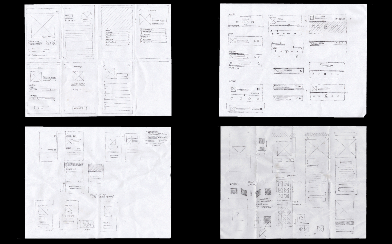
During the ideation and sketching phases, the goal of providing artists with a supportive platform was always at the forefront. After multiple rounds of exploratory sketches, I landed on a design route to investigate.

Birds of Ukraine

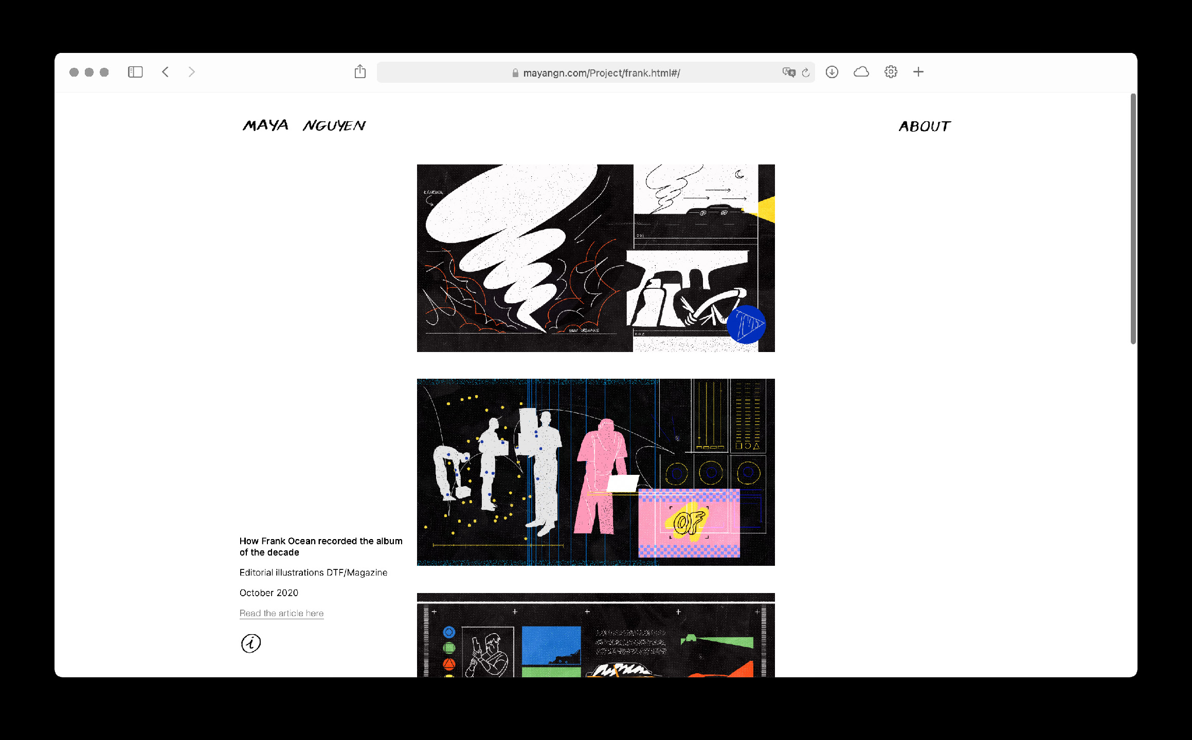
  • Maya Nguyen website home screen
  • Maya Nguyen website project screen
  • Maya Nguyen website phone screens

Birds of Ukraine

  • Website

“Birds of Ukraine” is a project started by the protective foundation of biodiversity of Ukraine that brings awareness to the extinction of birds of Ukraine. This is a collaboration between the foundation and the artist Sonya Atlantova, who is planning to illustrate over 100 birds over the duration of the project. I was in charge of designing the website for this project and you can view it here. Development by Timur Tursunov.


(Please note that due to the ongoing war in Ukraine the project is currently on hold and the website has not been updated)

Challenge

The challenge was to educate more people about the wildlife of Ukraine, introduce them to the work of Sonya Atlantova as well as accumulate new financial contributors to the cause of the foundation. All of this had to be done through a promotional and informative website that would need to have a user-friendly navigational experience.

Solution

Create a promotional and informative website that generates a larger online presence for the “Birds of Ukraine” project. I tried to achieve a balance between academic text and the illustrations so as to not overwhelm the user while maintaining user-friendly navigation throughout.

Process

Birds of Ukraine website sketches

Firstly it was important to impose the feel of the website, and the illustration had to have a lot of room to breathe within the design. I established a modular grid system on several of the pages on the website, dedicating 1 or 2 modules to a single painting with some text accompanying it on the other module in some instances.

The individual pages dedicated to each illustration and type of bird had to have the ability for users to inspect each piece in greater detail, so a zoom feature had to be enabled. Along the side of the illustration the information about each bird had to be displayed in a way that was easily readable, while still keeping the design of the page aligned with the rest of the website.


The client also had a requirement that the website had to be available in both English and Ukrainian. So from the beginning, it was important to make sure that all aspects of the website were responsive, not only for the sake of usability but also so it could accommodate the different amounts of text depending on the language.

Maya Nguyen

  • Maya Nguyen website home screen
  • Maya Nguyen website project screen
  • Maya Nguyen website phone screens

Maya Nguyen

  • Website

Maya Nguyen is an illustrator based in Kyiv, Ukraine that has a bold and distinctive aesthetic. She likes to play with different shapes and colours, bending them to her will to create eccentric narratives. I had the pleasure of designing and developing her portfolio website from scratch which you can check out here.

Challenge

When the initial idea for designing a portfolio website came up, I knew that Maya had significant experience as a freelance illustrator and graphic designer under her belt, as well as some studio work experience. The main challenge for crafting her portfolio then became "How would the end product be able to showcase all aspects of Maya's talents?"

Solution

Maya's work is quite bold, so I was aware that the portfolio website had to let her work speak for itself and not overshadow it in any way. However the line between dull and minimalism can be thin at times, so to ensure that the website never falls into the ladder category I had to think of creative, yet simple interactions that would differentiate the portfolio from others.

Process

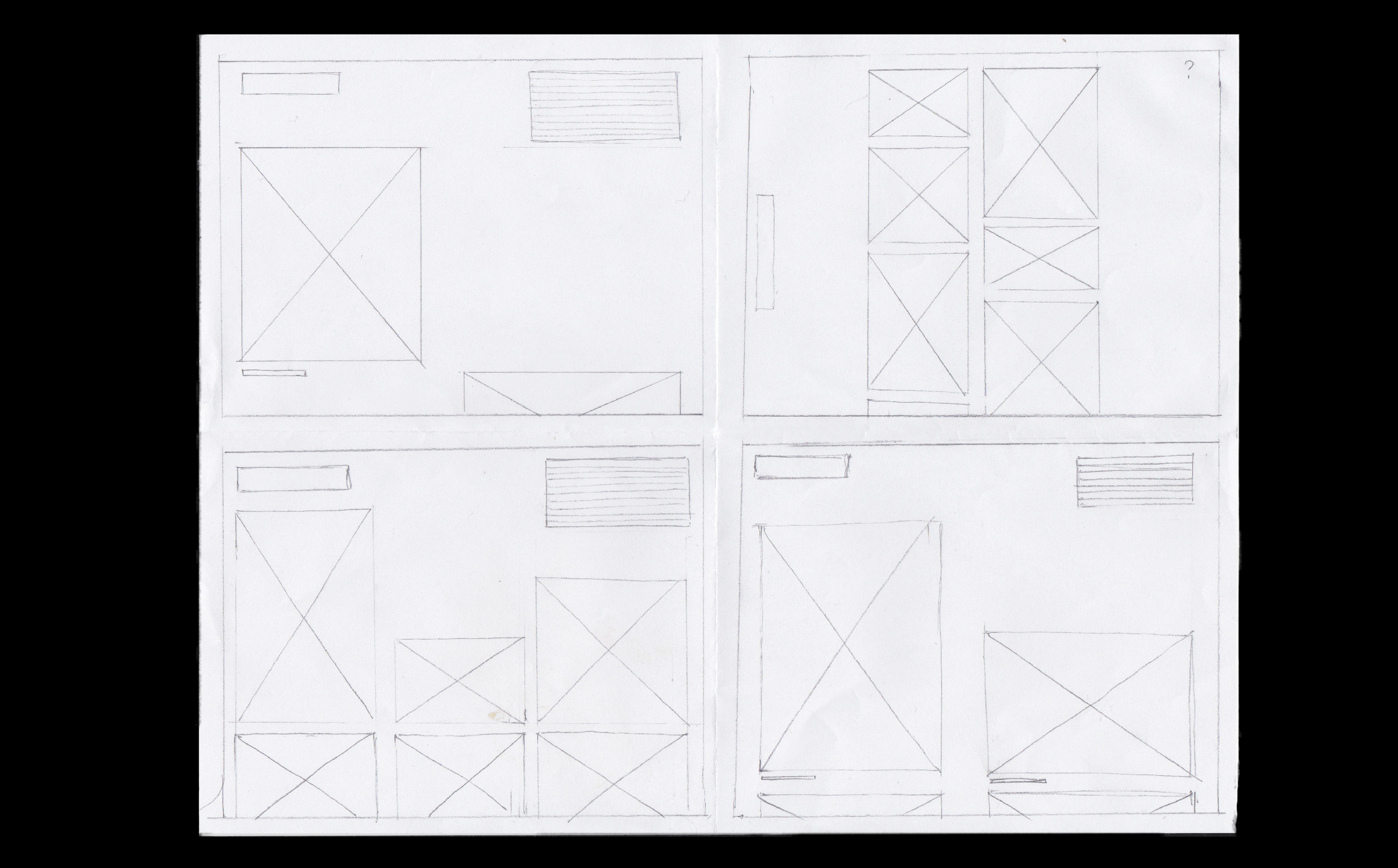
Maya Nguyen website sketches

After establishing a grid system for the website, the rest of the web layout became prime for experimentation. Keeping the overall goal of showcasing Maya's talents, I had to think of unintrusive ways for additional information to be displayed. Through multiple sketches and prototypes, I eventually came to the idea to add a responsive information button.

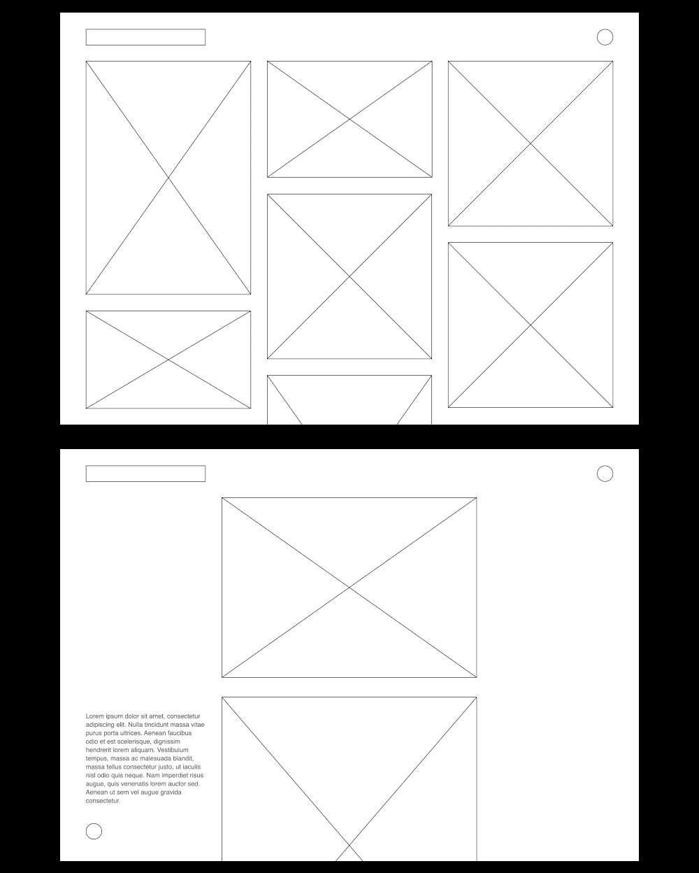
Maya Nguyen website wireframes

Throughout the process of coding the website, I had to make sure that it remained completely responsive and had multiple breakpoints, to ensure comfortable viewing on devices of different types. The information button came to be located on the lower left side of the desktop version of the website. Once clicked, information seamlessly appears if visitors decide to learn more about a certain project.


The website launched successfully and has allowed Maya to have a central location for all of her work, as well as a place to direct potential new collaborators. She has already reported gaining new clients thanks to her new portfolio.

Daria Zapriagaeva

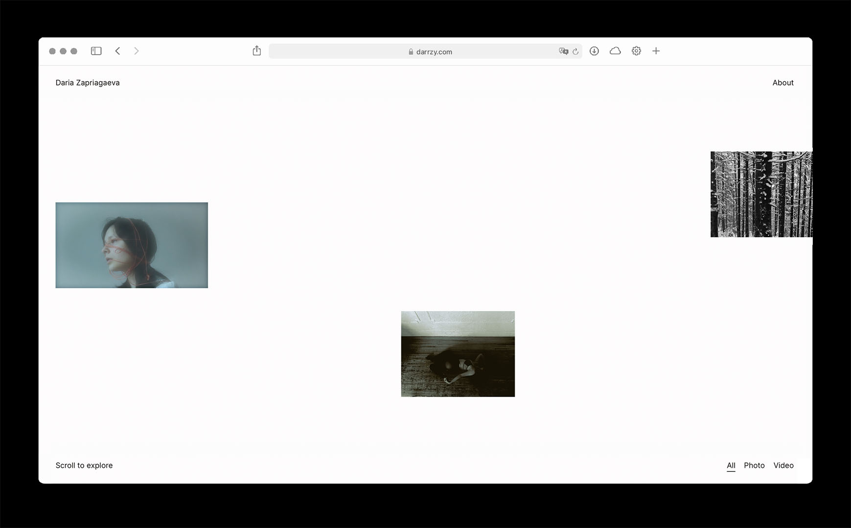
  • Daria Zapriagaeva website home screen
  • Daria Zapriagaeva website project screen
  • Daria Zapriagaeva website project blacked out screen

Daria Zapriagaeva

  • Website

Daria Zapriagaeva is a photographer and video creator based in Toronto, Canada. As a young professional who is in the process of establishing herself as a working artist, she was in need of a website that would showcase her work to attract potential clients and collaborators. You can check out the finished website here. Development by Timur Tursunov.

Challenge

Since Daria operates both in the realm of photography and video and is still developing her artistic identity, the challenge was to demonstrate her wide range of skills and her ability to work on different types of projects. Her pieces are expressive and contemporary, and the website had to reflect her ideals and the types of clients she would like to attract.

Solution

Daria's work is expressive and contemporary, and her website had to reflect her ideals and the types of clients she would like to attract. The end result is a website that translates the way photographs are displayed in galleries into a digital realm, creating a unique experience for users to enjoy Daria's art.

Process

Daria Zapriagaeva project references

The main inspiration for the website were real-life photo gallaries and the way photographs are displayed there. The first goal was to establish the composition of the home page, as it is the main way users can view all of Daria's work at a glance. The sizes of each project thumbnail on the main page were established to have a proportionate amount of distance between one another, keeping in mind how each thumbnail would scale on screens of different sizes.

Daria Zapriagaeva website skteches

The reason horizontal scrolling is implemented is to imitate the way photographs are typically displayed in real-life exhibitions. Alongside that, upon refreshing the main page the vertical layout of the project thumbnails shifts, granting users a new way of observing Daria's website in a different composition.


Upon entering an individual project, users are always able to see the number of items present in a project via the numbers displayed on the custom cursor. As well as being able to blackout the background by hovering over the visuals themselves, to create a more immersive viewing experience.

Monolite

  • Monolite interactive display

Monolite

  • Interactive Display

Monolite is an interactive display that was made in collaboration with the Interactive Media Management program at George Brown College, the Architecture and Design Film Festival (ADFF) and Cosentino, a company that specializes in manufacturing high-end surfaces for architecture and design. It was displayed at the ADFF in Toronto in 2019, as well as DesignTo.

Challenge

With only a few months for design and production, our team had to ensure that the end product would meet the high design standards of Cosentino, as well as entertain and inform the audience of the ADFF. As the design lead my role was to propose and create a design solution that would adequately meet the challenges stated above.

Solution

As the goal of this project was to promote content for both Cosentino and ADFF, the design that was ultimately chosen by Cosentino puts all emphasis on the ability of the user to discover information.

Pre-production

Monollite sketches

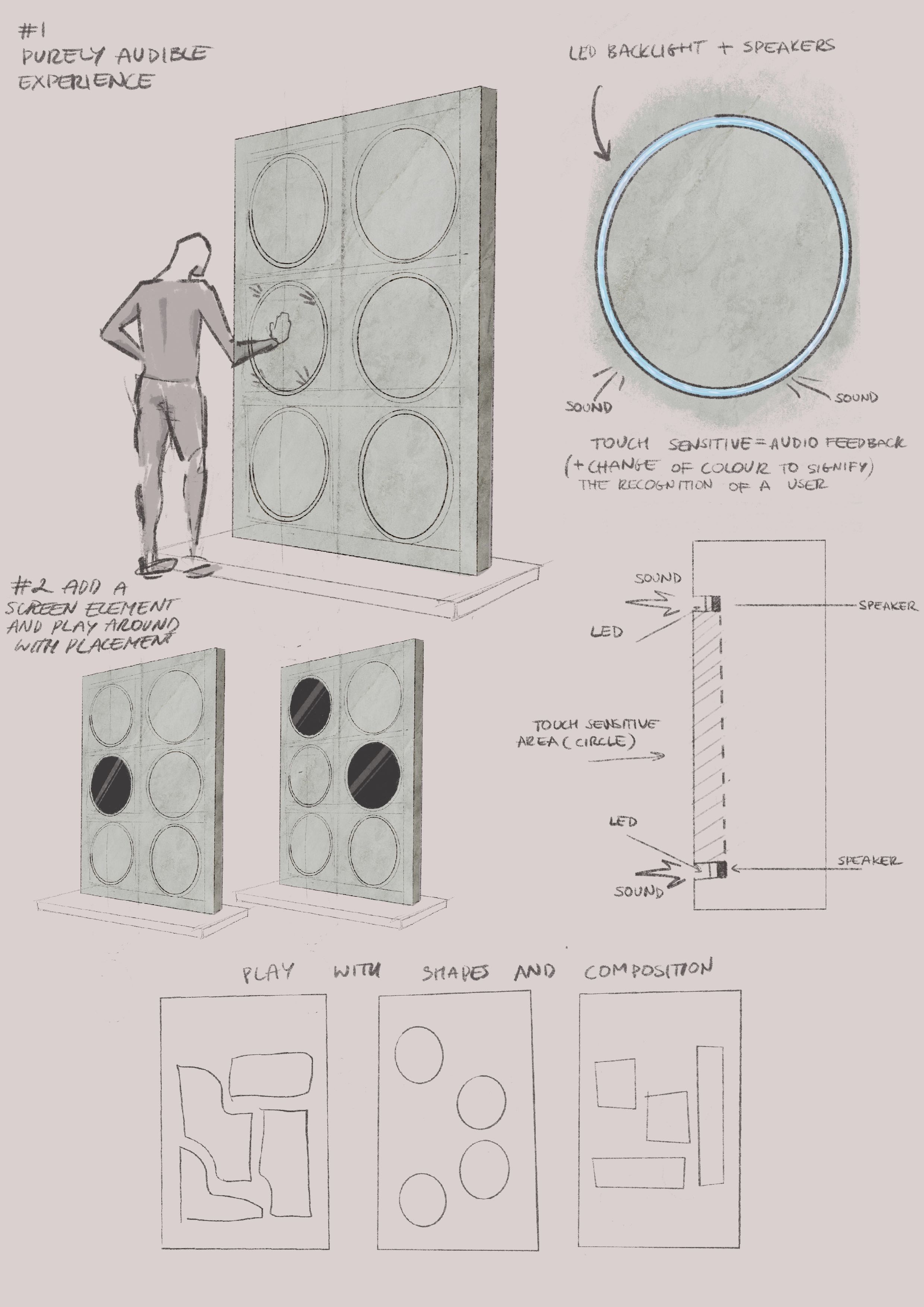
With this interactive exhibit, the user is faced with a series of buttons that trigger unique content depending on the combination of buttons pressed. Each of the 12 high-definition videos was curated by the team of the IMM program to be unique, visually appealing and engaging. Certain restrictions had to be kept in mind though. For example, the structure would be displayed on the crowded main floor of the Bell Lightbox, so the content had to be engaging without the presence of sound.

Monolite modeling process

As well as providing the designs for the Monolite, I was also responsible for creating the 3-D model and all of the measurements for this project.

Production

Monolite measurements

Once the final designs and measurements were approved by Cosentino, our tech team moved on to prototyping and testing the technical solutions behind the display. I was present on-site during the construction of the display alongside the tech team, who ensured that the display and its interactions were working perfectly.

After the interactive display was completed, it was located on the main floor of the Bell Lightbox in Toronto during the whole of the ADFF in 2019. After that event, the IMM program was also asked to display it at DesignTO in 2019.

Digital Postcard

Digital Postcard

  • Motion Design

During my studies in the Interactive Media Management Program at George Brown College, I was fortunate enough to attend a 3-D course. I was tasked with creating a motion video using Cinema4D that would have some personal backstory to it. I decided to make a digital postcard for the city of Istanbul, featuring one of its prominent architectural wonders the Blue Mosque. As I am part Turkish, this project meant a lot to me and it also took on more meaning as the covid-19 pandemic took rampage on the world and prohibited millions of people like myself to travel and visit their families.

Process

Process GIF of the Digital Postcard

I had to research the Blue Mosque, and due to my architectural education, I was easily able to analyze the structure. I initially mapped out the floor plan of the building, and once I had a solid foundation to work from I began simplifying the mosque and stylizing it.


The end result is a short bite-sized video featuring a highly stylized rendering of the Blue Mosque. I am hoping to continue the idea of digital postcards in the future by highlighting the many countries and cities that I have personal connections to.

Favourite Songs
of the Decade

Soundbyte

  • Motion Design

I had the pleasure of being a part of a Media Production course while attending the Interactive Media Management program at George Brown College. We were given a detailed overview of all types of media that can be a part of the design process of a digital product. Tasked with showcasing our motion design capabilities, I came up with a concept to look back and reflect on some of my favourite songs of the decade. Having the opportunity to combine my passion for music and design in a single project was really fun.